I think that the issues that we have had in the past two or three years, is to believe what the naysayers were saying, is to believe that the potential for growth around the PC platform in the established consumer developed market was gone. It is not. And it is not because I’m blind and I don’t see the growth of the iPads and tablets and I don’t see the declining or very modest growth of the PC platform, but new sales in the PC platform, we see all of that.But first of all there is just way too many PCs out there to be discounted, I don’t know of anybody that bought an iPad who threw away his laptop, in fact the laptop and the PC in general continues to be used in certain circumstances and as the iPad becomes the mobile platform of choice your laptop PC is even more residential and even more friendly to add-ons. So I think that we believed it because everybody was telling as this and it's because it's the simple thing to believe and in fact that was a mistake. In fact I don’t believe it at all, I think that obviously we have tremendous opportunities in emerging markets and around the PC of course, largely underpenetrated but we have solid opportunities across the number of categories in the western world in addition to what we are putting together more intensively which is a focus on PC peripherals in the business market, which is way underpenetrated on our side, and it's an add-on chance.

Wednesday, November 30, 2011
Thoughts on the PC Market From Logitech
Logitech makes peripheral products for PCs: keyboards, mouses, webcams, etc. I thought this was an interesting and impassioned statement made by the CEO at a tech conference a couple weeks ago. He may be a biased source, but his argument is that the demise of the personal computer relative to tablets and smart-phones is greatly overstated.
What Did Central Banks Actually Do Today?
Not a whole lot. Technically they lowered the cost of liquidity swaps with foreign central banks so that European banks can swap euros for dollars and therefore have better access to dollars. Of course, the swap lines have been open and no banks seem to be accessing them...
Below is a time series of the liquidity swap line of the Fed's balance sheet. Compared to $580B in swaps in 2008, today there are just $2B.
Below is a time series of the liquidity swap line of the Fed's balance sheet. Compared to $580B in swaps in 2008, today there are just $2B.
 |
| Click to Enlarge |
 |
| Click to Enlarge |
S&P 4% Days
Apparently it was a little premature to make a post highlighting the number of 3% days that the S&P has had because we ended up with a 4% day--of course, an even more rare occurrence. In nearly 14,000 trading days since 1957, there have only been 83 times that the S&P has been up or down by 4% or more in a single day. More than half, 46 of those times have been between 2008-2011. 71% of these days have happened since 2000. The frequency table is presented below.

For reference, the first leveraged ETF began trading in 2006.

For reference, the first leveraged ETF began trading in 2006.
S&P 3% Days
Another day, another >3% change for the S&P 500. If it seems like volatility continues to be extreme, the chart below should be a supporting image. The chart shows the number of days each year that the S&P 500 has had a more than 2% or 3% move (in either direction) since 1957. Clearly volatility has increased over time.
 |
| Click to Enlarge |
By decade: in the 2000's, there were 114 days that the S&P moved by more than 3%. In the 1980s there were 24 and in the 60s there were just 6. In fact, before the year 2000, there was not a single year that had more than 10 days that the S&P moved by 3%. This year we've already had 12 such days.
Pending Home Sales
Pending home sales data for October was released this morning and showed a nice 10.4% m/m jump on a seasonally adjusted basis. Not-seasonally adjusted, the data still showed a healthy 8.3% increase. Pending home sales is one of the more forward-looking housing indicators because its data precedes settlement which happens 1-2 months later. Existing home sales only measures transactions that have been settled.
The index is still below 100, which is the base level of activity that was present in 2001, when the index was first created. Below is the regional data comprising the index. Only the West and South are above 2001 levels, and even then only marginally so.
The index is still below 100, which is the base level of activity that was present in 2001, when the index was first created. Below is the regional data comprising the index. Only the West and South are above 2001 levels, and even then only marginally so.
 |
| Click to Enlarge |
Tuesday, November 29, 2011
FDIC Capital Requirements and Bank of America
How much capital is enough capital for a banking institution? Many forget, but the FDIC actually has statutory standards for capital adequacy. Banks can exist in five categories: Well capitalized, Adequately Capitalized, Undercapitalized, Significantly Undercapitalized and Critically Undercapitalized.

If this isn't enough capital, then can there be an adequate amount? Banking regulation like Basel III has focused primarily on forcing banks to hold more capital. But if market sentiment turns, is there any amount of capital that is enough?
BAC's stock is starting to trade as if there is real risk of the bank collapsing. If it does, rest assured that it wont be a symptom of capital, but instead liquidity. BAC faces the threat of a bank run. As far as liquidity is concerned though, BAC also has a huge stockpile. BAC has $81B in cash and equivalents. Adjusted for the size of its balance sheet, WFC has about half that much. WFC has $18B in cash.
If you trust the audited financial statements (do you have a specific reason not to), then BAC isn't just well capitalized, it has a fortress of a balance sheet. Its fortress happens to be under attack though, and under a large enough surge, even the strongest walls can fall.
"Under the regulations, a “well-capitalized” institution must have a Tier 1 risk-based capital ratio of at least six percent, a total risk-based capital ratio of at least ten percent and a leverage ratio of at least five percent"
A well capitalized institution is the highest standard. At each subsequent level, the ratio drops by 100 bps (e.g. an adequately capitalized bank would have a leverage ratio of 4%).
BAC's stock is at $5 per share today because of a perception in the marketplace that the company doesn't have enough capital. Below are the capital ratios for BAC as of Sept 30. Notice that Tier 1 capital and Total capital ratios are 500 bps above the well capitalized threshold and tier 1 leverage is 200 bps above the highest FDIC capital threshold.
BAC Capital Ratios at 3Q11

If this isn't enough capital, then can there be an adequate amount? Banking regulation like Basel III has focused primarily on forcing banks to hold more capital. But if market sentiment turns, is there any amount of capital that is enough?
BAC's stock is starting to trade as if there is real risk of the bank collapsing. If it does, rest assured that it wont be a symptom of capital, but instead liquidity. BAC faces the threat of a bank run. As far as liquidity is concerned though, BAC also has a huge stockpile. BAC has $81B in cash and equivalents. Adjusted for the size of its balance sheet, WFC has about half that much. WFC has $18B in cash.
If you trust the audited financial statements (do you have a specific reason not to), then BAC isn't just well capitalized, it has a fortress of a balance sheet. Its fortress happens to be under attack though, and under a large enough surge, even the strongest walls can fall.
Top S&P 500 Performers Since May
The S&P 500 peaked this year on May 1, but that doesn't mean that there haven't been components that have gone up since. The index is 12% lower than it was then, but there are 99 (20% of the index) stocks which are still positive since. Below are the top 20.


AMR Balance Sheet at Bankruptcy
The anatomy of a chapter 11 filing:
Negative equity
Negative free cash flow
Acid test ratio: 0.58x

Negative equity
Negative free cash flow
Acid test ratio: 0.58x

2011 Large Cap vs. Small Cap Performance
Today is a unique day in that while the S&P is up 40 bps, the Russell 2000 is actually negative by 20 bps. Large cap's outperformance for the day is making up ground from yesterday when the Russell outperformed by a larger margin. YTD though, the smaller stocks that make up the Russell 2000 have badly lagged the S&P.
Many think of the Russell as a higher beta play on stocks, so maybe it's not too surprising that it's lagging. Still, after a 10 year period of outperformance, the Russell trades at 19x forward earnings while the S&P trades at 11x. Certainly this has some influence.
 |
| Click to Enlarge |
Monday, November 28, 2011
GRPN Down Another 9%
GRPN was down another 9% today and is now down almost 50% from its peak the same day that the IPO began trading. The market cap of the company is now just $9B, or 33% away from where GOOG offered to buy the company for cash not too long ago. That's probably not an offer that's coming back...

BAC Stock Ugly as Usual
Despite opening up by as much as 6% today, it can't be a good sign for the bulls that coming into the last hour of trading, BAC is close to going negative for the day. A comparison of the intraday charts of the S&P and BAC are below.


Average Daily S&P 500 Change By Month
Earlier this month, I posted that the trailing 90 day volatility in the S&P 500 has been the 4th highest since 1951. The last week has only continued to push the average daily S&P 500 change higher, and today's 3% move certainly hasn't done anything to ameliorate day to day volatility.

To put the month so far in context, below is a chart of the average daily move on the S&P 500 by month so far in 2011.

The 1.5% average move means that the value of the 500 largest publicly traded US companies has swung by about $180B each day.
Wednesday, November 23, 2011
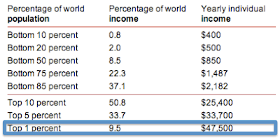
Happy Thanksgiving to the Top 1% (that probably means you)
On a day that the Dow was down 236 points, it doesn't feel like there's much to be thankful for. Between Europe's collapse, Washington's gridlock and China's slowdown, it seems the world is a dangerous place for investors. Despite all the scary headlines, there is of course lots to be thankful for, even from an economic standpoint. Most notably: we are a nation of 1%-ers.
The Occupy Wall Street movement has drawn plenty of attention to the income distribution within the United States, pitting the 99% against the 1%. But what goes overlooked by these well meaning folks is that compared to the other 6.7B people on the planet, those occupying Wall Street probably don't come close to being in the 99%.
In the US it takes an income of $250,000 per year to be considered a 1%-er, but if you take the global population into the calculation, the number drops to just $47,500. Considering that median household income in the US is $50,000 per year, this means that at the very least half of Americans live in a household that earns at the 1% level. Even the US poverty line, which is set at a family of four earning less than $22,000 is not too far from being in the global top 10%.
Compared to inequity of global income distribution, the intra-US distribution is no great injustice at all. That is something to truly be thankful for.

Global Income Distribution

Data is from the World Bank.
FDIC 3Q11 Review of US Banking System
BAC may be just 15 cents shy of trading with a 4 handle, but the FDIC's 3Q11 banking report released yesterday paints a picture of the US banking system that is actually rather healthy.
Despite persistent economic worries in the 3rd quarter, US banks were finally almost fully back to 07 earnings levels. US banks earned $35.3B in the quarter compared with $35.6B in 3Q07.

On an ROE and ROA basis banks showed similar signs of healing. Even though investors continue to worry about the earnings power of banks under a new regulatory environment, returns on equity and assets continue to improve and are almost back to pre '08 levels as well.


Banks are earning these profits at much higher levels of capital as well. The US banking system is extremely well capitalized. The stress tests wont show anything different.

This is especially true because credit continues to improve. Barring another recession, banking balance sheets should continue to get better. For now, they seem to have turned the corner.

Mr. Market's Wild Ride
The S&P 500 just bounced off of the exact 10% drawdown mark from the October peak, 1163. As you may recall, the October peak happened to be the inauguration point of a new bull market (20% rally off the lows). Meanwhile, the October low was the day that we inaugurated a new bear market (20% drop from May highs). With 10% already trimmed from the market, we're just 10% more away from another new bear. Bear, Bull, Bear--it's getting tough to remember what type of market we're in...

The new bear would come at 1033. Let's hope we don't get there.
Tuesday, November 22, 2011
Comparing the S&P 500's Decline Since May
Last month, I posted that the October rally kept the S&P on pace to retrace the pre-recession decline of October 2007. Since October 14th when I first posted that chart, the market continued to rally at first, but has since lost steam. Below is an updated chart comparing the declines--still largely tracking each other.


15 Companies You Could Own For the Price of Groupon
Groupon may have been down 15% today, but the company still sports a hefty $12.8B market cap. While an individual shareholder doesn't have to spend the whole $13B to get a share of the company, assuming one wanted to buy the whole thing, here are 15 other companies that an investor could buy for the same amount of money. Of the list, only one has less revenue than Groupon over the last 12 months, but none has fewer profits.
If you had $13B, would you rather own Groupon or Hershey?...
 |
| Click to Enlarge |
Stocks with High Short Interest
Below is a list of the 15 stocks in the S&P 500 with the highest short interest as a percentage of float. Given the way that financials lead the way lower on down days, one might expect that financial companies would be on this list. Surprisingly though they're not.


Broken Growth Stock Face Off
Much to the delight of this value investor, NFLX and GMCR are now both officially broken stocks. NFLX is down 75% from its peak and GMCR is down 56%.


NFLX is trading below a 20x multiple at just 16x.


NFLX is trading below a 20x multiple at just 16x.

GMCR is still at 38x

The amazing comparison is the market caps. NFLX is less than a $4B company now, while GMCR is still almost $8B. Should GMCR be worth twice as much as NFLX? It has roughly the same revenue...
Monday, November 21, 2011
Interest Rate Seasonality
Below is a chart of the average monthly change in yield for the 10 year treasury over the last 60 years. Historically November has been the most favorable month for the rates market. So far despite the 4% fall in equities markets, rates haven't moved quite as much. The 10 year is right where it started the month, at 1.96%.
 |
| Click to Enlarge |
Dow 50/200 Month Moving Average
As long as we're on the subject of trends, below is a great trend chart of the Dow over the last 100 years. The trend lines are the 50 and 200 month moving averages, which are increasingly converging as the market continues to move sideways. The last time that the two averages converged was in 1980 at the start of a 20 year bull market. Will that condition be met again before there's another true bull?


Gold Trend Still In-Tact
Today, gold was down more than $40 causing some to question again whether August was a peak. So far, there hasn't been anything about gold's chart that is out of the ordinary though. Back in August, I posted that following a big spike in the price of the metal, gold tends to have a several month period of consolidation. Since that time, the price of gold hasn't gone much of anywhere, true to form. If gold continues to trade like it has in the past, now would be a good time for it to begin breaking out again.
There's nothing like gold to make technicians out of all of us.

Friday, November 18, 2011
The Problem with the Leading Economic Indicator Index
This morning, the index of Leading Economic Indicators (LEI) was reported as being up 0.9%, which was better than analyst expectations. Below is a chart comparing the LEI to the index of Current Economic Indicators.


The LEI continues to hit new all time highs, and has increased substantially since 2009. Unfortunately the CEI hasn't quite kept pace. The LEI is supposed to foreshadow increases in CEI, but clearly it hasn't. The divergence between the two indices would seem to suggest that the LEI isn't doing a good job of highlighting factors that truly lead economic activity. If it were doing a good job, the CEI would be rising at a similar rate and at least have recovered to its pre-recession high.
A closer inspection of the underlying components of the LEI show why it has painted a skewed picture of economic prospects:
 |
| Click to Enlarge |
The LEI is a broken indicator because it is too heavily influenced by monetary policy. In October, the interest rate spread (steep yield curve) contributed 0.22% to the 0.9% increase in leading indicators. Even though the steepness of the yield curve has changed only marginally since 2009, the interest rate spread has pushed the LEI higher by roughly this amount every month since the Fed started easing. This accounts for much of the divergence from CEI. As long as the curve is held artificially steep, it will continue to drive LEI higher.
The fact that LEI is a broken indicator is as much an indictment of failed Keynesian monetarism as it is a statement of the inadequacy of a this particular metric. LEI is driven higher by the flawed theory that easy monetary policy can stimulate economic production. CEI shows that this premise is entirely incorrect. Simply put, CEI isn't rising as fast as LEI because monetary policy has less of an effect on the real economy than monetarists would like to believe.
Thursday, November 17, 2011
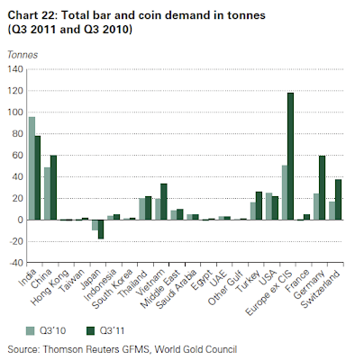
Gold Demand Trends
The World Gold Council released it's 3Q11 report of trends in global gold demand this morning. There were a number of interesting charts presented below.
Despite the significant rise in the price of gold, demand for gold has remained reasonably flat:


Gold Demand for Jewelry
Jewelry demand has historically been and continues to be driven by East Asian countries. India and China dwarf the rest of the world in terms of demand for gold for jewelry purposes. Of course, China and India also have the largest populations in the world, so perhaps this isn't too surprising. Still consumption of gold on a gdp/capita adjusted basis likely shows a similar picture. In other words, Chinese and Indian consumers spend a larger portion of income on gold than any other countries.
 Gold Demand for Investment
Overall investment demand rose during the third quarter. The geographical increase is striking. Europe saw a large increase in demand for gold bars and coins. No doubt this was driven by fears over the integrity of the Eurozone and the common currency. The chart below hints at the level of panic in the Eurozone.


Despite the significant rise in the price of gold, demand for gold has remained reasonably flat:

Gold Demand By Category
In this decade, the interest in gold has skewed more towards investment than at any time since the 1980s, when gold hit its all time inflation adjusted high. Interestingly, gold demand in the 2000s was predominately jewelry driven. The price of gold obviously rose significantly in that environment as well.

Gold Demand for Jewelry
Jewelry demand has historically been and continues to be driven by East Asian countries. India and China dwarf the rest of the world in terms of demand for gold for jewelry purposes. Of course, China and India also have the largest populations in the world, so perhaps this isn't too surprising. Still consumption of gold on a gdp/capita adjusted basis likely shows a similar picture. In other words, Chinese and Indian consumers spend a larger portion of income on gold than any other countries.

Overall investment demand rose during the third quarter. The geographical increase is striking. Europe saw a large increase in demand for gold bars and coins. No doubt this was driven by fears over the integrity of the Eurozone and the common currency. The chart below hints at the level of panic in the Eurozone.

Gold holdings in ETFs continued to increase in the 3rd Quarter. ETFs hold more than two years worth of demand for Gold.

New Gold Discovery
On a fundamental level, new gold discovery has slowed in recent years. Along with monetary policy, this no doubt provides support for the price of the metal.

BAC 25 year Chart
Bank of America is back below 6 dollars per share again today, and there doesn't seem to be much sign of reprieve for the banking giant. Outside of the depths of March 09, BAC hasn't sold at this price since 1991. In 1991 BAC had $119B in assets, today it has over $2T. It had $6B in capital compared with more than $212B today. It also only had 228m shares outstanding--today it has 10B.
 |
| Click to Enlarge |
Euro vs. S&P
With just one month and change left until the end of 2011, it certainly has been a wild year for investors-- driven substantially by headlines from the Eurozone. Still, despite all the negative news and fears of dissolution of the Eurozone, investors would have been better off this year having held Euros over US stocks. The FXE euro currency ETF is still up 0.84% YTD.
 |
| Click to Enlarge |
Initial Unemployment Claims
Initial claims fell this week to 388,000--still elevated, but certainly an improvement. Below is a time series of initial claims (4wk moving average) since 2000. Today's level is still consistent with the levels seen in the 2000 recession.


Wednesday, November 16, 2011
Stuck in Neutral
It seems like markets have been on quite a roller coaster ride over the last few months, and as mentioned in a previous post, the average daily move of the S&P 500 over the last 90 days is the 4th highest it's been in 50 years. However, net-net, we really haven't gone much of anywhere in November. To illustrate the point are four relative strength charts for four different assets that don't show any sign of extreme--hovering right around the 50 mark. Which way we'll break is anyone's guess.
 |
| Click to Enlarge |
Tuesday, November 15, 2011
Sony Considers Internet Rival to Cable TV
The Wall Street Journal is reporting that Sony is in talks with cable networks to stream content directly to devices over the internet. This is interesting not only because it's one of the more forward thinking moves that Sony has made in a long time, but also because it is just the start of what is likely to be a major change in the world of television. The internet enabled television is on the cusp of mass adoption. From WSJ:
Sony Corp. is considering launching an Internet-based alternative to cable-TV service, say people familiar with the situation, the latest threat to cable and satellite operators that now dominate pay television.
The Japanese electronics and entertainment company has approached several big media companies that own TV channels to negotiate the rights to offer TV channels over the Web to U.S. consumers, the people say.
Sony is proposing to beam the channels over Internet connections to Sony-made devices including PlayStation gaming consoles, television sets and Blu-ray players, those people said.
Retail Sales vs. Wages
Retail sales were reported this morning up 0.5% for October and up a robust 7.2% on a year over year basis. The growth in consumption has been pretty spectacular, especially compared to wage growth as demonstrated in the chart below.
A caveat about the chart above: the scale can be a bit misleading given that each series is plotted on a different axis. Also, wages (right axis) is an annualized number while retail sales is monthly.
 |
| Click to Enlarge |
Monday, November 14, 2011
Words of Wisdom From The Oracle of Omaha
Buffett gave a 3 hour interview on CNBC this morning. Below is an excerpt echoing sentiment that he's expressed hundreds of times elsewhere as well:
BUFFETT: Well, I don't know about (ETFs) specifically, but I would think anything that causes people to think they can trade actively in stocks and do better than if they sat on their rear is a terrible mistake. American business has done wonderful, wonderfully for investors over the years, yet many investors have managed to turn in bad performances. You can say to yourself if the Dow started the 20th century at 66 and is now at 12,000, how could anybody lose money? But people do lose money. But they lose money by trying to jump in and out of this and that and think that, you know, they should buy this stock because the earnings are going to surprise on the upside or some crazy thing like that. If they just buy good businesses, they'll do fine. Just like if they bought good farms 30 years ago they do fine or good apartment houses 30 years ago, they do fine. So volatility is your friend, not your enemy. It—as long as it creates cheap prices from time to time and it does.
BUFFETT: So it—the investing game is simpler than it looks, you know, and if people would read "The Intelligent Investor" in chapter 8, they'd do fine.
S&P 500 Aggregate Statistics
Some random statistics on the S&P 500:
S&P 500 aggregate market cap: $12.01T
TTM aggregate revenue: $9.86T
Aggregate book value: $5.95T
Average gross margin: 45%
Average operating margin: 14%
For comparison:
US GDP: $15.2T
Saturday, November 12, 2011
US Protein Production
Interesting macro food industry chart pulled from a presentation by Darling international.


Friday, November 11, 2011
S&P 500 Average Daily Move
Another day, another triple digit move on the Dow and >1% change on the S&P 500. The markets have certainly been volatile lately, but how does the last few months' volatility compare on a historical basis?
Below is a chart of the trailing 90 day average daily S&P 500 percentage change (absolute value). The 1.6% average daily change over the last 90 days is the 4th highest reading since 1957. The only periods that saw a larger average daily change were Fall 2008/Winter 2009, Fall 2002, and Winter 1988.
Below is a chart of the trailing 90 day average daily S&P 500 percentage change (absolute value). The 1.6% average daily change over the last 90 days is the 4th highest reading since 1957. The only periods that saw a larger average daily change were Fall 2008/Winter 2009, Fall 2002, and Winter 1988.
 |
| Click to Enlarge |
Wednesday, November 9, 2011
Sovereign Debt to EBITDA Ratios
By now, most people are probably familiar with a chart that looks something like the one below. It shows sovereign debt as a percent of GDP as of 2011. (All data are 2011 IMF estimates)
 |
| Click to Enlarge |
The ratios are meant to give a snapshot of the solvency of each country. Like a Debt/EBITDA ratio for a company, this ratio is intended to demonstrate the amount of funds that are available to service a country's debt obligations.
The problem is though that no government has a lien on 100% of GDP, so this is not an accurate measure of the pool of funds that can be used to service debt. Governments only control a portion of GDP shown in the table below:

There is an upper limit to the amount of GDP that a government can tax. At 100% a government is theoretically enslaving its population. Anything above 50% (and perhaps even lower) begins to erode output levels as workers lose wage incentives. The optimal level of taxation relative to GDP is difficult to know, but most should agree that the lowest tax level that maintains a fully functioning government is best.
The amount of GDP that a government currently controls has important implications for its ability to balance its budget. For instance, because the US and Japan tax at low rates they could theoretically increase taxes to balance their budgets. On the other hand one could argue that taxes in a country like France are already so high that any deficit spending could only be remedied by spending cuts.
Obviously the amount of deficit spending varies from country to country though. The chart below shows each government's deficit as a percentage of total expenditures. Put another way, it's the amount of spending that is financed through borrowing.

Japan for example finances nearly 25% of its total expenditures with borrowed money. The United States finances a similar amount. Italy on the other hand finances less than 10% of its expenditures, suggesting that Italy would have to cut less than Japan or the US to achieve a balanced budget. A combination of tax increases and spending cuts could actually produce a modest surplus perhaps, calling into question the idea that Italy's debt burden is totally unsustainable.
True sustainability of debt should be based on weighing the debt burden against the cash flows that the government generates. The chart below shows governments' Debt to Revenue multiple, which is the closest metric to Debt to EBITDA that could be generated without more granular data.
 |
| Click to Enlarge |
Obviously EBITDA is a smaller percentage of revenue which would increase these multiples. Like any company, governments have mandatory operating expenses before debt service. Therefore there is some EBITDA margin that can be estimated. It is probably conservative to estimate that at least 50% of revenues are for "fixed cost" operating expenses. The residual pool is what is truly available for debt service. Using this assumption, the leverage turns for each of these governments would be doubled. This means that Japan has an estimated 15x Debt/EBITDA ratio, Greece 8x, etc...
A company generally would be considered investment grade at about 3x leverage on a Debt to EBITDA basis. That company would likely be rated BBB and trading at an average spread of about 275 bps as of yesterday's close. 15x leverage is certainly at high yield levels.
On an "estimated" debt/EBITDA basis, not a single one of these countries is below 3x leverage, not even the so called healthy European countries: Germany and France. Importantly, Japan is significantly worse than Greece, and the US is more levered than Ireland, Italy and Portugal. And yet Japan, the US, Germany and France all issue debt that trades with no spread to a risk free rate of return and trade at a significant discount to inflation. Surely this is truly unsustainable.
Subscribe to:
Posts (Atom)